Book Review: The Visual Miscellaneum
Note: Book for review kindly provided by HarperCollins.
I first heard about this book from Nathan of Flowing Data (a data visualization blog I read semi-religiously) and I knew I had to read it. I love data displayed in any form, and in fact, part of my job at work is helping people to visualize data in a way that makes sense to them (although I don’t get to play around with pretty graphics as much.)
David writes a blog called Information is Beautiful from whence some of the data for the book emerged. The book is truly beautiful, and it is obvious, and not just from his website, that the author put his life into it. The colors are as amazing as the cover looks and some of the concepts are ones I would never think about blending together to provide images. Some of my favorites were the spouses of dictators, food colorings linked to unpleasant health defects, and a timeline of global media scare stories, which contrasts how much media attention the story got with how many people they actually killed (ex: Swine Flu.) And, I love the title. I am also thrilled that McCandless included the software he used in compiling the book so that I can play around with it in a similar manner for data display.
That being said, I take issue with a couple of things in the book, aside from the printing errors in this current edition. One is that, after a year, many of these topics will become irrelevant. For example, he has a list of internet virals that goes up until 2008, many of which I don’t even know, even though I practically live online. Will he have to update this edition next year to include a fresh list of internet virals? Will internet virals even still be relevant next year? I often like to judge a book by how relevant it will still be 5 years from now, and unfortunately, this doesn’t pass the test, although it is internet-centric, which maybe says that I shouldn’t hold it up to this metric.
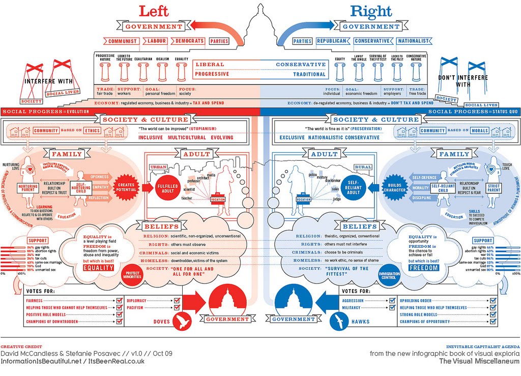
McCandless also tends to belay his political leanings, as shown in this image out of the book below, which completely simplifies both left and right wing beliefs, and a chart he has later on in the book about how much land in the West Bank remains Israeli/Palestinian, as well as numerous, numerous charts about climate change, the hot topic of the day. There is also a table about the good things that happened during Bush’s two terms in office with the title “The good of Bush: Stuff that improved under Dubya.” I think, many times, not having been accustomed to his work before, I’ve become very guarded and cynical when he comes across as playful in what is, to me, supposed to be an objective presentation of data. Although, as many will tell you, even solid data is hard to present objectively.
Overall, brilliant eye candy, but remain alert.
Related on the Blog:
Jon Stewart, America’s Most-Trusted Newscaster
Scenster, Hipster, Hippie
My Own Attempts at Data Visualization (are awful)


