Blog Redesign!
Note: This is a lot of designer-y and tech-y speak, so if you want to skip it, I’m going to have a fun post up later today.
My birthday is Friday, and the present I gave to myself, aside from making a promise never to go on WebMD ever again, is learning CSS and HTML to redo my blog in WordPress. The result is what you see here, and I think it’s a little easier on the eyes, more cross-browser-friendly (*cough* IE users you know who you are and please for the love of God stop using it), and just easier to navigate in general than the previous version.
There are still some tweaks I have to make, such as tag all the “Friday Links” with the same tag so that you can open them up via nav bar, but not have them clutter up my main posts. Overall, though, I like it a lot, and hope you do, too. If you have any constructive criticism, either from a user or designer standpoint, I’d love to hear it.
The major improvements I’ve made:
- Better spam blocker for trackback spam and comment spam
- Better image viewer so when you clicky to enlarge pictures, you’re not taken away from the site onto a new page
- Better comment-leaving system incorporating HTML (bold, italics, etc.)
- Comment trackback so you know when someone replies to your comments
- Easier to navigate Friday links in one category tab (coming soon)
- Prettier layout, easier to read with the light-gray colors
- IE/Firefox compatible
- Easier to scroll through site to see past posts with snippets instead of whole posts
Basically, I have enough tools under my belt now that I can design WordPress blogs for pay.
I’m going to have another, non redesign-related post up today, but just for fun, kind of like Design*Sponge’s cover post, I thought it would be cool to show you how I went through header ideas and color schemes for the site. Design is hard, yo.
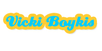
This was my original logo and placeholder. I love using the font Creampuff for all of my logos so that it’s easily-recognizable as my “brand”- whimsical and humorous.
Second iteration. I knew I wanted something other than “Russian, Jewish, named after a strawberry,” because I think the tagline’s too limiting in what I discuss on here, which is practically everything, but within the framework of Russian and Jewish and strawberry-ness. But still playful. Cause you know how I do. So I decided on the tagline below. I wanted to also keep the Creampuff logo with my name.
I decided, after that, that I wanted to go in a more comic-y direction, since I often do a lot of comics on this blog. So I started with this:
But then I felt like it was too busy, so I changed it to the following, so the background could bleed through:
 But then that was too plain again, also the photo was a little TOO cynical, even though Mr. B said “You look like this 90% of the time”, so I started moving it around and came up with..
Which eventually became…
P.S. A big thank you to, first and foremost, Mr. B, for helping me on the backend (that’s what she DIDN’T say) with Apache, DNS, and other issues that I am too stupid for on my own right now. To Jamie for inspiring me to make my site look pretty as the ones she designs although she totally doesn’t know it, to Andrew for lots of helpful tips via Twitter and also being a stellar designer I look up to, and to Matt Mullenweg for having a very cool blog design that served as inspiration halfway through.


