How a Book Cover Gets Made
Sorry in advance if the next week is going to be book-heavy in content. It’s just that I’ve been working on the book steadily over the past two months and seeing it finally come to fruition is kind of exciting. I promise the blog will be back to normal after next week. Well, Vicki-normal.
Self-publishing means that the author plays the role of every step: writer, editor, publisher, marketer, accountant, and IT web magic girl. Generally, this was really exciting because it taught me more about business in 2 months of concentrated activity than my MBA program has all semester. The downside is that you are alone. Mr. B helped tremendously with editing and web IT magic, but other than that, it was just me and Google.
One of the most important parts of producing an ebook is the cover. It has to catch the eye in two seconds in an Amazon thumbnail. It also has to summarize the book, look professional, and look interesting. All in a couple pixels. Oh, and you have to pick a title that captures the spirit of the entire book as well.
Today, I thought it would be fun to share the iterations I made in creating the book cover because oooo pretty pictures.
My first draft was really serious and rigid. And my title was So Serious. So here’s the first cover I made, using one of my own photographs of Loch Ness: Very Franzen, no? I knew I wanted to use blue since it’s both a Scottish and Israeli color. It’s also my favorite color. I also knew I wanted the Scottish flag in there somewhere, but not to be too blatantly obvious.
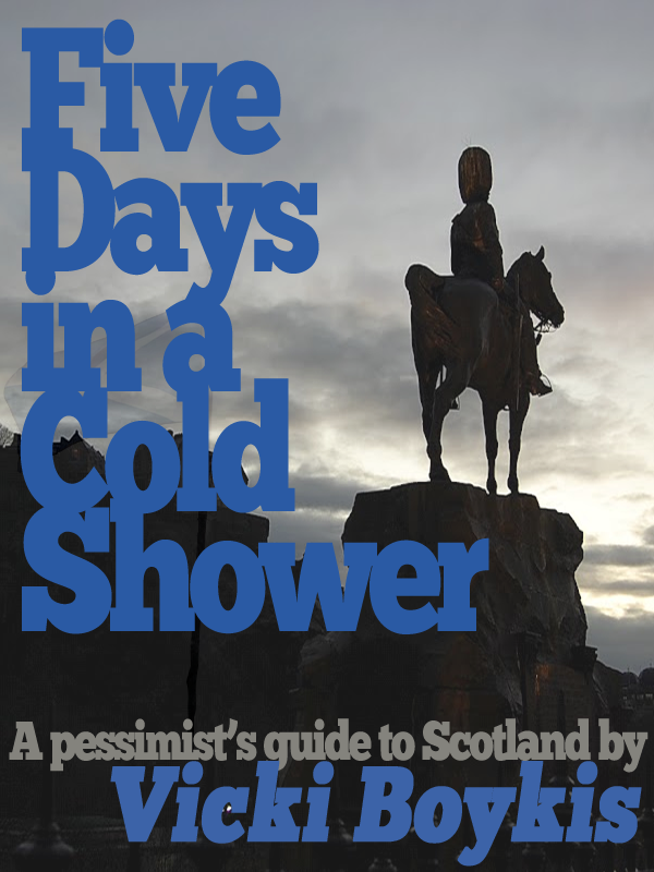
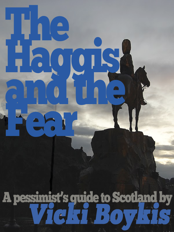
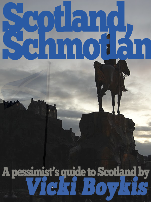
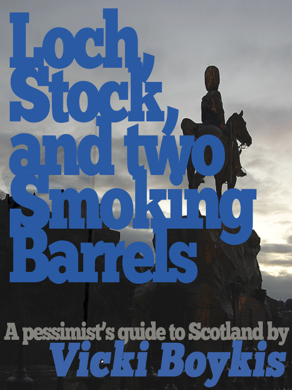
Then, right after I decided I loved it, I knew it had to change. Because it’s way too much text and no one can see anything. So I picked another image that I’d taken that I really liked, of a statue juxtaposed with Edinburgh Castle. By that time, I’d been struggling with a title for three weeks, and I started brainstorming for something better. You can kind of still see the flag from the previous cover. I was ambivalent about leaving it in. But at least I was loosening up in my writing.
They were all good, but not great. The cover was still too serious for a light-hearted book. So I flipped the horse dude to be contrarian and brightened up the colors. The cover also didn’t reflect the fact that I was coming at Scotland from a different angle than other travel books, so I came up with what I thought would be the final cover.
But according to my focus group (Mr. B and Mr. B’s mom), it wasn’t the best. So I threw everything away and started from scratch. Think, I said. What is this book really about? Once you have a good title, you’ll come up with a good cover. I wrote down over 200 words that my book had to do with. I combined them. I looked for pop cultural references. I did this over four days. Then, as I was bitching to Mr. B in the car about how I didn’t have a title, he said, “How about ‘There’s Something about Scotland?'” as a joke. Mr. B came up with my title for me in 5 minutes. It was exactly perfect: playful, short, and evocative of the entire book. I could now design a cover around the title. I saw blue in my head, and for some reason, I knew this one had to be done with all typography instead of pictures.
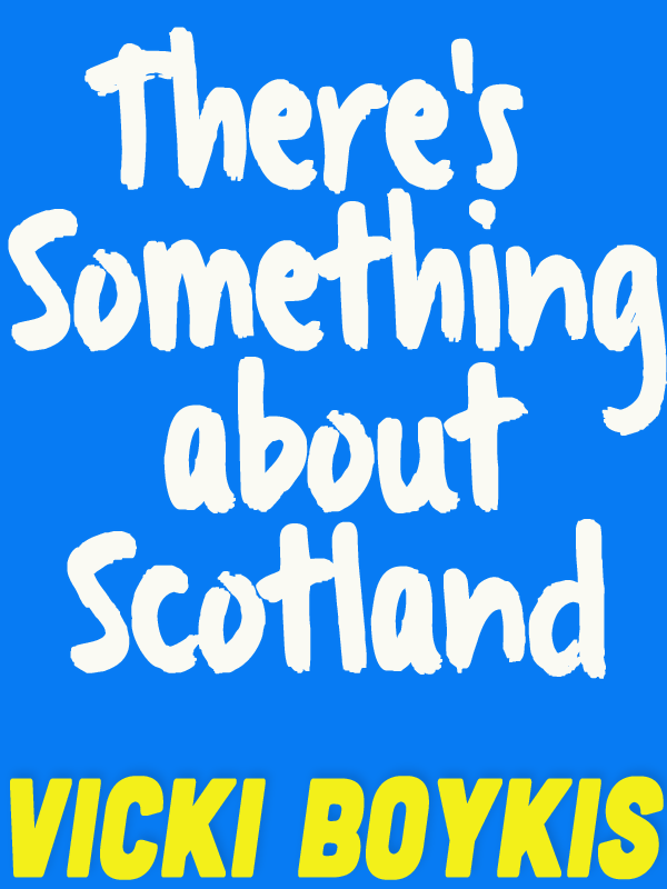
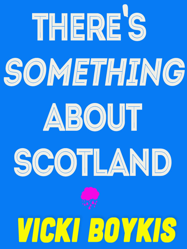
But I also knew that it had to be a quirky font. The cover was also too light. Too hipster. I tried brush strokes first. Too Amy Tan.
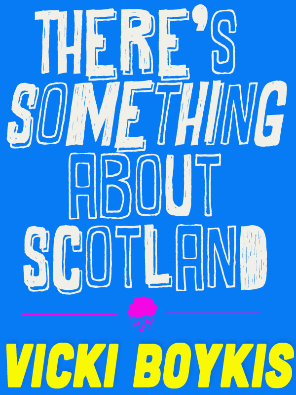
Not quite, but I was getting much closer. I played around with the brushes. Of course! A cloud! Evocative of my entire trip.
Finally, after a couple more passes through, I was done. A cover that caught attention, was playful, and still conveyed the entire spirit of the book, and all in four weeks and over 30 iterations. That was easy. I won’t even describe the actual book editing process.

