Breaking down Apple's iOS Screen Time report
One of the most valuable things I’ve learned in the early part of my career spent as a data janitor business analyst is how to put together visuals that are actionable. After all, as data professionals, we’re not putting together charts for the sake of looking good. If we were, we’d be the “Data is Ugly” subreddit. The point of a good chart is drive a person (usually the executive you’re presenting the chart to) to commit to an action.
I’ve been thinking so much in action-oriented charts throughout the years that it’s almost a knee-jerk reaction to analyze any visual that I come across. Lately, a chart-based app that I’ve been spending a lot of time with is Apple’s Screen Time feature on iOS, Screen Time, which allows you to track and place limits on how much time you spend on your phone (or other iOS devices).
As much as I rail on Apple, the feature is a step in the right direction to digitally declutter. our lives.
The first day I used it, I was in shock. I consider myself a pretty low-tech person for a person who works in tech (no Facebook/Messenger, Instagram, WhatsApp, or Netflix on my phone), but found myself staring at a report that said I was spending upwards of 3 hours using my phone every single day.
Here’s what the two screens look like:
| Daily Screen | Weekly Screen |
|---|---|
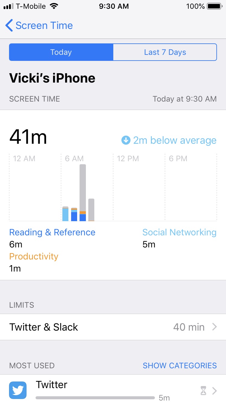 | 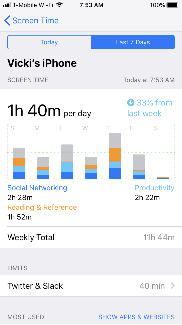 |
And the scroll-down on the first screen:

For more details on how it all looks, check out this video.
The app has been successful in that I’m regularly spending less than 2 hours a day glued to my phone. But, I have some real qualms about the way the report is designed and couldn’t help but drill down into its effectiveness.
Generating good reports
The main goal of generating data-driven visuals is to get someone to take action on them. Over the course of my career, I’ve really leaned on the following tips to make my reports and charts better:
- Reports should be easy to access. The method of access should be tailored for your audience.
- Reports should be easy to read and simple to interpret. This includes:
- Style of chart and color choices
- Data sourcing
- Labeling of all axes
- Reports should include a data glossary or data sources
- Reports should be easy to drill down into.
Let’s walk through how the Screen Time feature rates on these criteria:
Ease of Access
This is a big fail. There is no dedicated Screen Time app shortcut. In fact, unless you watch Apple keynotes or read the tech press, there’s no way at all to know that the feature exists. To get to it, you have to click into “Settings”, and scroll down two screens, where it’s located under “Do Not Disturb”.
Spending more time rooting around your settings menu to spend less time on your phone is extremely annoying.
The positioning reminds me of dashboards I used to create for executives. I’d meticulously arrange a report in Excel, line up all the rows, color-code it, and shade it, only to find out that executives rarely open attachments since they tend to be on the go, and view everything on their phone screens as inline emails. My reports weren’t getting looked at, ever.
It’s really important to tailor reports to your audience - in this case, people who want to quickly find out their usage, with probably an app on their main screen.
Interpretability
Let’s take a look at the main chart again:
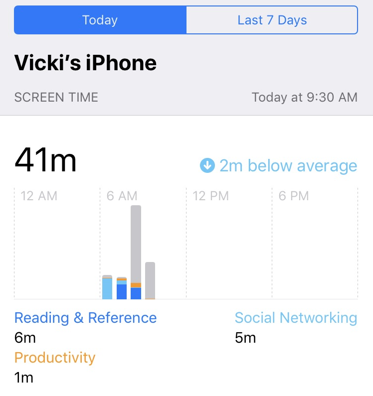
The colors are great and color-safe. It’s easy to see what’s going on in any given time period. But, there are a couple issues. Can you spot them?
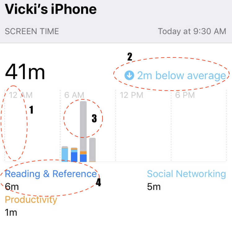
There are no labels on any of the axes. I’m assuming the x-axis is time, but what is y? Is it minutes? Total time spent? Times I looked at those apps? It would be helpful to have a label here.
There’s no indicator as to what the “2 minutes below average” references. Is it the average for that day? That week? Over the app’s lifespan? Knowing this helps me determine whether I need to really regulate my time or if it’s not such a big deal.
There’s no legend explaining what the gray area is referencing. It’s not “Reading and Reference” or “Productivity” or “Social Networking”. Is it time I spend browsing around on my phone? In other apps? I’m spending a lot of time there - how can I decrease it if I don’t know what it is?
It’s hard to see which apps are in these categories. Personally, I’d rather see a breakdown of time spent on a daily basis by app on the chart, like is available below, so I can focus on those specific apps instead of categories.
Data glossary and sources
This brings me to the next part: explaining data metrics and sources. It was drilled into me by a well-meaning supervisor at an internship long, long ago that each chart should have a source, a footnote into when the data was pulled, and any additional information that would help the decision-maker be comfortable with the source data.
Apple is Apple, and they have the power, not the consumer, so they can do whatever they want. There are no definitions for how any of the metrics are calculated. For example, what does “time spent” in the app include? What is a pick-up? When does tracking start and end?
I’d really love to see a methodology section. But, even simpler than that, there are so many questions that could have been answered by putting a simple gray question mark at the top of the metric without increasing the amount of clutter in the application.
Ability to drill down
This is probably the worst part of the Screen Time feature. In line with Apple’s overall approach to selective simplicity, the app doesn’t allow you to control several key things: which apps fall into which categories (i.e. “Reading and Reference”), or the ability to allot an amount of time to a single app versus splitting it for multiple apps.
As a result, the report reflects what Apple thinks is a “good” use of your time, even though that might not be the case. It tracks intent as Apple understands it, but not intentionality. For example, the app always tracks phone and messaging usage, which I personally don’t count as “screen time.” It also tracks YouTube, but for me personally, I use it as a streaming music app in the car rather than to watch videos, which the app and report also don’t allow toggles for.
The app itself is a blunt instrument, and the report is even blunter. It allows you to see what you did today, or what you did for the past 7 days. The 7 days screen only shows you the data in aggregate. It doesn’t show you the breakdown for each day, and you can’t see any breakdown by week-over-week or month over month. There’s no ability to annotate days to intelligently understand patterns of usage.
All in all, here’s how I’d change the main chart around a bit, while still preserving the clean interface that Apple so craves:
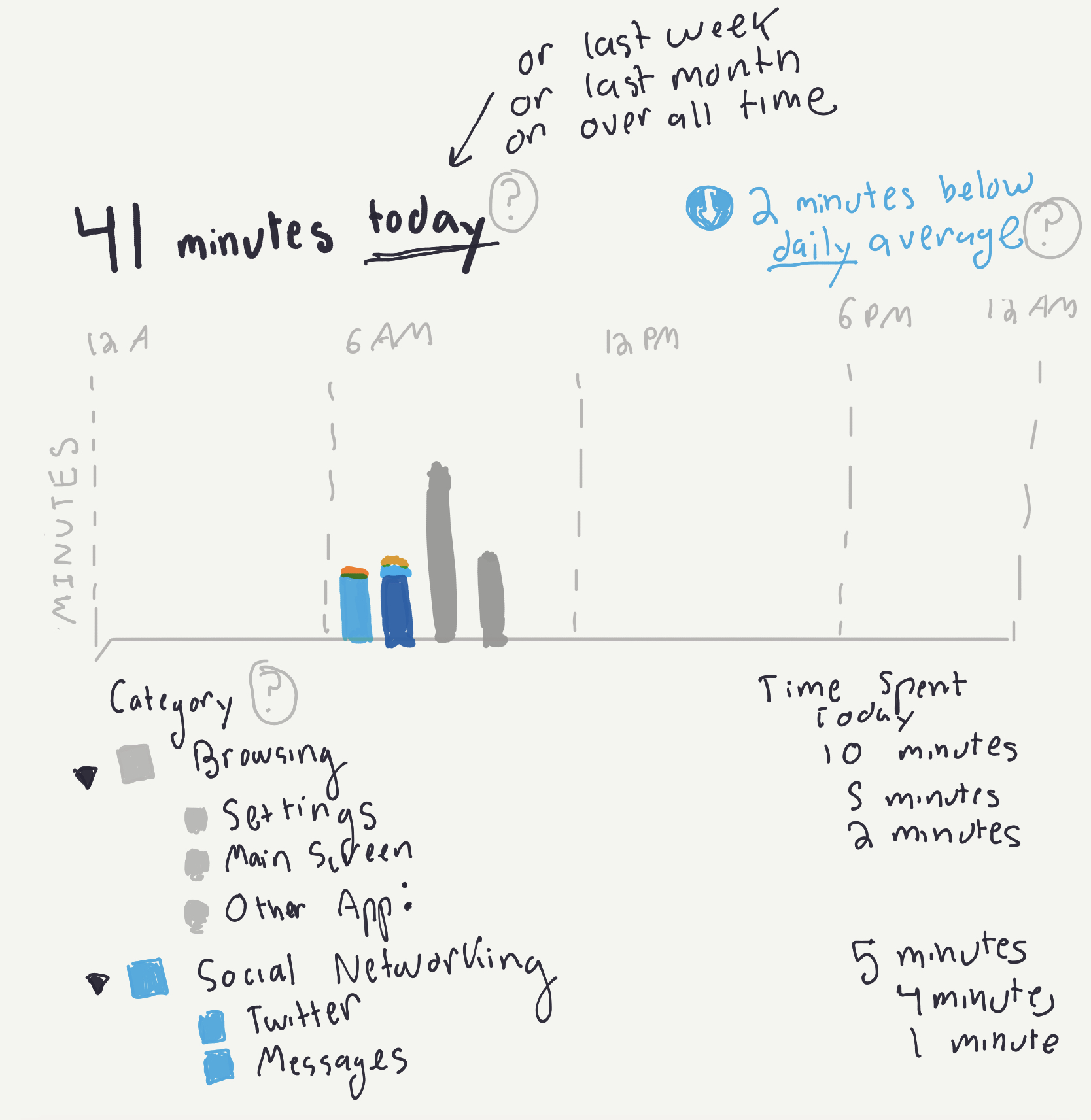
But is it a good report?
There are a number of problems with the report, where the user’s intent misaligns with Apple’s intent (and, to an extent, iOS’s architecture. For some of the tracking features I talked about, it’s probably hard to discern when a user is doing x,y, or z on the screen.) There needs to be a great deal more user education going into the feature, which, as of now, seems to be extremely neglected (even though it’s just been released). My hunch is that Apple didn’t release this for the consumer’s benefit - after all, why does Apple benefit if you spend less time on its phone - but to thwart off competitors in the app store.. As such, it’s not a great report.
However, even though the charts fail on most of the criteria I talk about, they still succeed in a big way: I’m spending less time. Or, at least I think I am (based on the limited weekly data.)
Ever since I opted into Screen Time about 2 months ago, I’ve been using it to incentivize myself to decrease screen time usage on my phone, and I’ve been relatively successful - I’m now down to less than 2 hours a day.
This poses an interesting dilemma: Would I have reduced my time even further with some of the changes I suggested?
How bad does a report have to get and have people still get something out of it?
In the case of the Screen Time feature, it seems like Apple is really trying to test that boundary.
#data #statistics #data science #hci #product culture